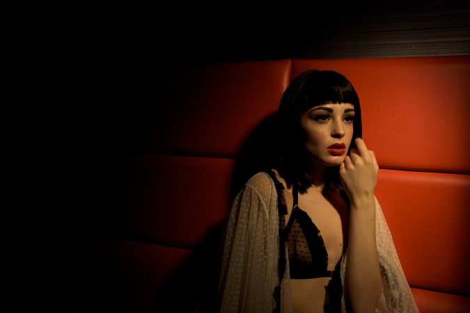
As part of our continuing series of free tutorials we have another portrait session, this time with Brighton photographer Eleni Mettyear, who was shot by Kevin Mason. Again we will break down the lighting set-ups, the final shot, and the reasons behind the decisions made- hopefully this will continue to give you ideas how to incorporate some aspects of this into your own portrait work.
(Please note we are still working on the Tess Video tutorial- just trying to figure the most accessible format to deliver it to everyone.)

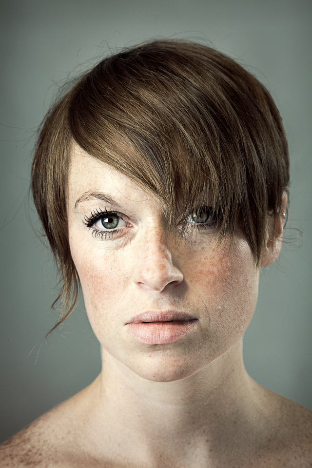
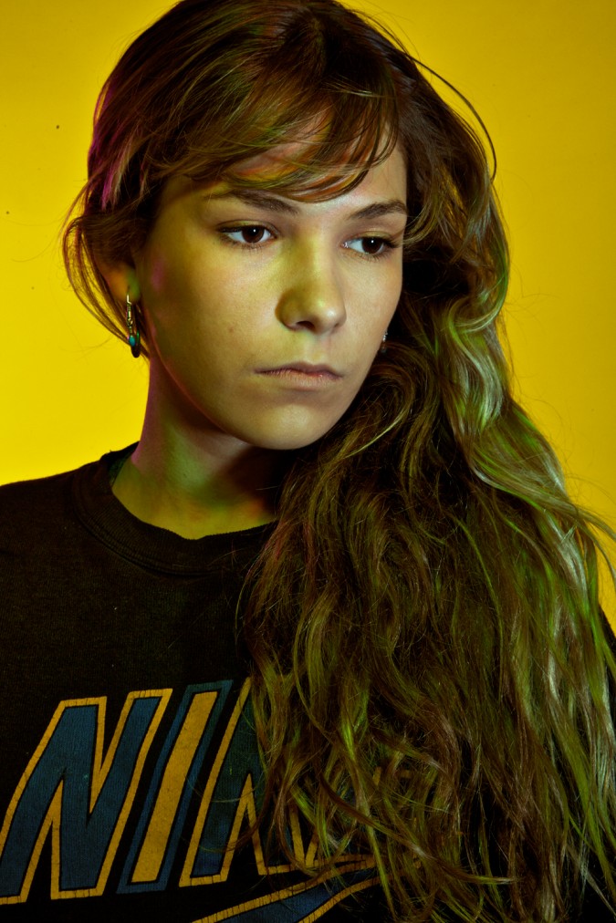
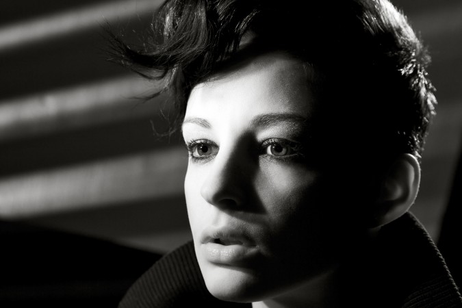
Kevin- I wanted to make a considered portrait of Eleni- I think she is an amazing individual, and although very lively has a calmness and strength to her as well. I deliberated with something that was monochrome, but instead chose to sculpt her face with coloured gels, which I think helped balanced the ‘contemplative’ image I had in my head before the session started.
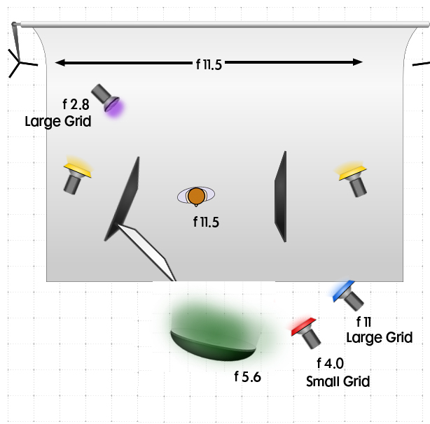
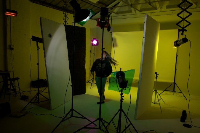
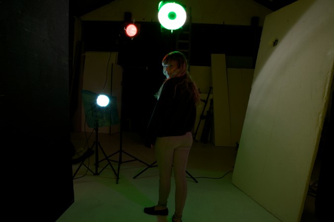
The lighting in this is detailed below, 
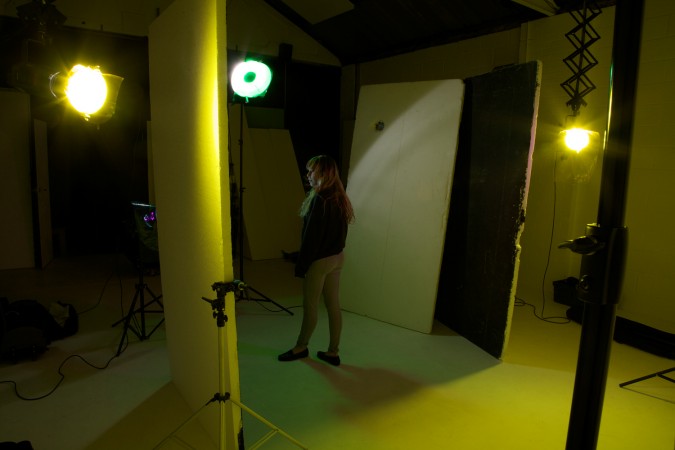
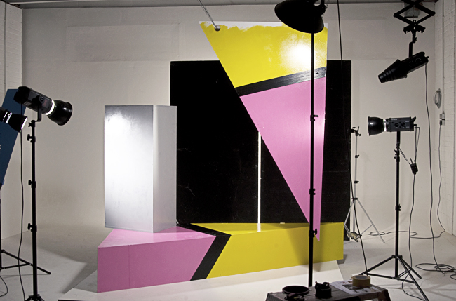
The background is a light grey colorama- changed to a deep yellow by gelled heads either side. A combination of beauty dish up high and 2 gridded strobes on camera right lit the subject, whilst a white bounce camera left, filled in the shadow.
To create a firm edge to Eleni, and to stop excess spill from the background light two black polyboards were used either side.


As you can see the set-up is quite restrictive, the lights effectively help to ‘control’ the subject, and leave less down to direction. Even so though we worked a lot on small details with the hair, the direction of the face, and the tightness of the frame. Kevin doesn’t crop images so it was essential to get a frame that worked and allows enough movement through it by the viewer without either becoming too cramped or too much space isolating the subject.
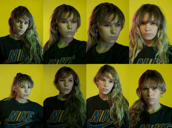
You can see some of the unedited variations below. Whilst shooting we did move a light to camera left- and you can clearly see the affect of this in some of the shots below- but then Markus suggested a White Polyboard to bounce and fill the shadow instead of a further strobe. This allowed us to keep the face as the dominant side of the frame, which was complimented by sweeping all the hair over Eleni’s left shoulder, helping flow through the image.

The final shot was then edited in PS to lift the tones and contrast but push back some of the individual colours about 10%.
The key here though is not to worry overly about the technical aspect- maybe try and set the lights in advance (you can shoot this with constant lighting and a tripod) but to concentrate then on getting some connection with the subject, or guiding them towards what you feel the image needs. A quick glance over the unedited shots can show you easily which images are more just a ‘likeness’ of someone rathe than a portrait that says something about the subject or to the viewer.
More soon, any comments/questions or areas you want clarified then please let us know, and we will also post another session next week.
