Kevin and Natasha had a shoot with Brighton band Pope Joan for the March Issue of the Brighton Source this Saturday night.
It was a fairly late start due to everyone involved being really busy all week but turned out to be a real blast. Kevin has shot the band before, an ill fated location shoot for the student Guide and was eager to get something he knew the band would really like this time around. James Kendall, Source Editor and Matt Barker, Source Graphic Designer have suggested a more stripped back series of covers this year- which fortunately is a direction that Kevin wanted to take after all the full blown set pieces of last year. But sometimes its actually harder to shoot in this way- a lot of the time previously the set could ‘do the talking’ whilst hopefully not overpowering the subjects but adding something to an impactful cover. When you get presented with 4 blokes in a band, well its just about the worst number, and with no girl it can all get a bit tricky. It suddenly becomes about engagement with the subject and every little detail becomes more crucial.
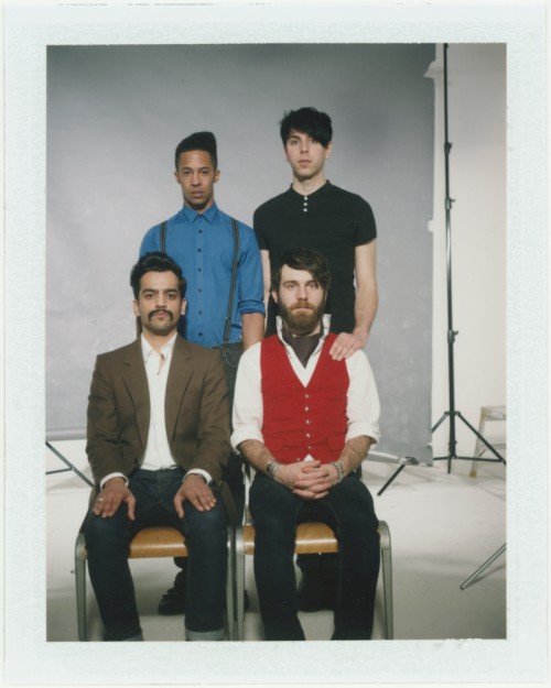
Fortunately Pope Joan have a very strong look, very precise sartorial excellence. They wanted something that worked along a ‘family portrait’ aesthetic, and we decided to push it to somewhere a bit more forced and static. We only shot Polaroids (on the 340 Land Camera) and 2 rolls of Portra NC on a Bronica ETRSi 40mm.
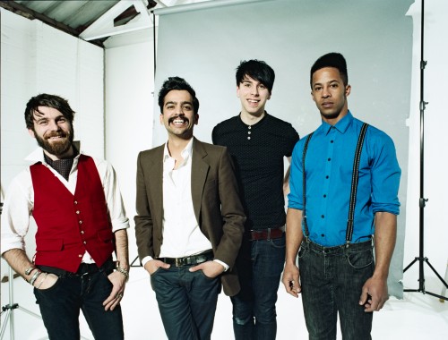
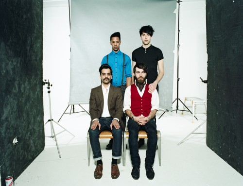
I have included the full uncropped image here, as was intended but obviously it will be a much tighter crop for the cover itself- losing the black boards..
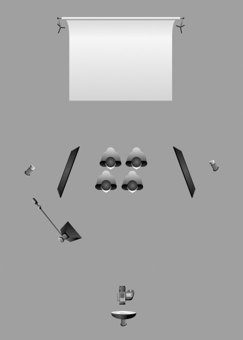
We have also dropped a little lighting diagram in using a template from Kevin Kertz which can be found via
this link

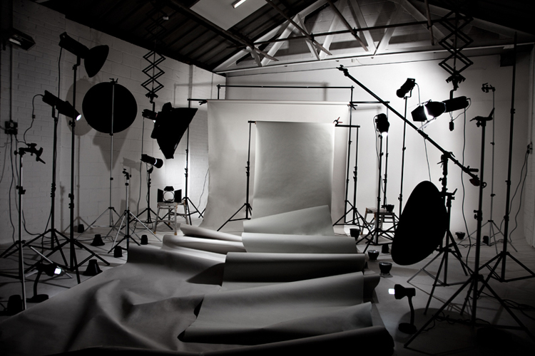
The main light is a Beauty dish directly above the camera, approx 8-9ft high, we then used a little fill from a Softbox camera left to ensure both seated and standing band members were fairly evenly exposed. We have two Bowens 500w on our lighting rig pointed at the Grey Colarama, and flagged these off with the Black Polyboards so there was no excess spill onto the band. The Black boards also add a harder more defined edge to the subject. Kevin actually did most of the lighting here whilst Natasha sat and drank beers and behaved in general like a very entertaining Art Director….

As you can see its a nice clean light, and you can see by the shadows on the floor how the polyboards help contain the image.
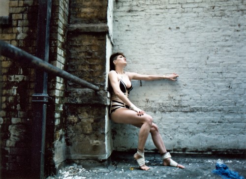
Heres a Polaroid 340- on peel apart fuji film- its got a nice feel, but maybe a bit too soft for printing…
