Blog

New Studio Lighting courses

We are really pleased to finally announce Studio Lighting Part2. After numerous requests from previous students we have added a follow on course of advanced studio lighting to equip you with all the skills needed to make it in the world of commercial studio photography. DarkDaze is pretty excited about this one, and he is running it alongside his lighting assistant Natasha Alipour-Faridani and the regular Garage Studio stylists Stevi Jelbart and Emma Sandham-King who run Ophelia Fancy.

This course is designed to allow you to really work with a brief, a client or to really push your own ideas. The focus will be on learning, working directly with a model and 1:1 tuition, including portfolio review. To read more just follow this link.

Arty Magazine Cover Shoot

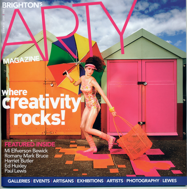
DarkDaze shot the new cover for Brighton based Arty magazine. We have some copies in the Studio now, and its looking great, pick a copy up here, or at venues around Brighton…

DarkDaze shoots Arty cover for Garage Studios.

DarkDaze shoots Arty cover for Garage Studios.

Cover shoot for Brighton based Arty Magazine

DD was approached by the founders of new Brighton magazine, Arty, as they wanted him to be the first featured photographer in the premier issue of the mag, and oddly enough the cover image that they had used in the mock-up was one of his, that they had seen in a local gallery, North Laine Photography.
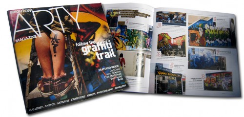
Arty Magazine Issue1

Arty Magazine Issue1

At Garage Studios, we like to support as many local artists that we can, in fact we will be hyping two of our former students with a write up soon, as they have used skills and techniques taught on several of our courses for a new venture…and if we see talent then we cant help but promote it, and Torben and Alison at Arty Magazine seem to share that mentality too. They are also as obsessed with good printing and heavyweight papers as DD himself is….. so it seems a good match.

Torben, asked DD to shoot a new cover for Issue2, a summer issue, out in August, now the last shoot he did for them turned into the epic full blown GS team involved and a whole bunch of models, a 2 day set build etc… You can see the backgrounds image here, if you missed it, and the final shot is here so we knew we had to pull off something kinda special still.

The brief was fortunately loose, and invloved summer/brighton/seaside and we needed to get an ‘art’ feel across in the image, as the mag profiles a lot of artists from sculptors to graphic designers painters etc….
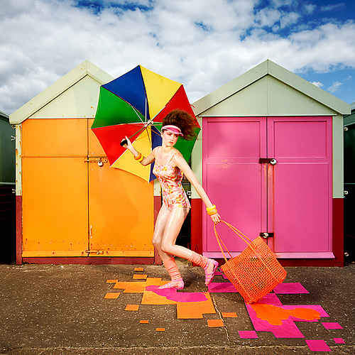
Friday Midday...Teenage Lobotomy.... for Arty Magazine

Friday Midday...Teenage Lobotomy.... for Arty Magazine

DD and Emma Sandham-King had some ideas left of a melting themed shoot, that they couldnt shoe-horn into something that they had planned a few weeks back. We wanted a lot of petrol and oil based products (hey even fashion photography can have some reference to the real world…) and give a very summery, but global warming themed image. We knew the beach huts had been shot to death in Brighton, but thats cos they are pretty dope and so after a few last minute worries we decided to stick with that as a location, having checked out the most excitingly painted ones last week, and settled on orange and pink.

We ran around town together, busting through a bunch of our favourite shops (and Primark) getting as much themed coloured items as we could, bulky and plastic orange and yellows, some hot pink jelly shoes, a dirt cheap golf umbrella and the Brighton Orange ‘lobster pot’ bag, which is actually the stylists own.

We used some cheap polystyrene tiles from B+Q for the floor, trying to create a feel of ‘pixelated’ beach hut colours falling onto the floor, as this was a rushed shoot we ended up painting them on site, it was pretty windy, so we spent a lot of time running around chasing them as they flew off down the seafront. Once the tiles were down we had to hold them all in place with sticky tape and pebbles until the model was in position.

The model- as you know Elin has shot with DD a lot by now and not only is she versatile and hard working but she can throw a killa pose at a seconds notice. Emma had styled her in a vintage swimming costume from To Be Worn Again, and Janeen Witherspoon Cove, and Emma Watson worked on her make-up and hair respectively, with a lot of bold colours, and the hair was wired up to make it look windswept as if she was really running. We held the hair away from the face with a killer pink visor we found in Primark.

Elin- after the shoot

Elin- after the shoot

Emma poured (non-toxic, watersoluble) paint around her jelly shoes and the orange plastic bag to create the melting effect, and the MUA’s greased her legs with some extra cocoa butter for the slick summer look. We used the umbrella to blog out the houses of Hove that showed thru the gap of the two beachhuts, and ensure Elins head didnt get lost in the background.
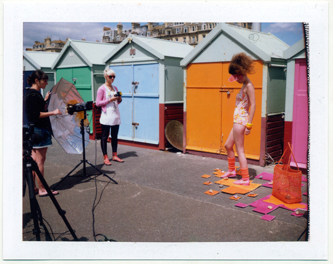
Arty Magazine by DarkDaze Wide Shot Polaroid 340

Arty Magazine by DarkDaze Wide Shot Polaroid 340

The lighting was really simple on this as you can see from the polaroid above- tash had to stay on umbrella duty, but it still blew inside out and snapped, but fortunately didnt bring the light over. We had one Bowens 500w, barndoor camera right, about 45º at the model, with a yellow gel on it, and to balance that a 500w Bowens camera left with a yellow gel, bouncing into a silver umbrella to produce a clean zingy kinda light. We had approx f16 into the model, and the ambient light was f13, so we were able to get added punch to the clouds and sky when we shot at f16 in camera. Oh we also had a Nikon flash off camera between the camera and the barndoor light, which was handheld at shoulder height, also gelled, pointed at the models face, to get a bit more lift and light into the face, hair and visor.

We didnt shoot tethered on this but had a hunch the exposure was working, there was a pretty hefty difference when the sun disappeared every few minutes, but when it came out, everything seemed to balance, its rare that we’d recommend shooting at midday with a full sun overhead, but when your throwing light across the image like this then its gonna work just fine. Polaroid test below-
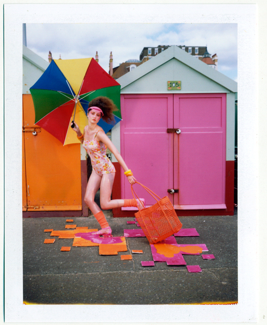
Arty Magazine by DarkDaze test shot Polaroid 340

Arty Magazine by DarkDaze test shot Polaroid 340

So we did a mad dash to get all the pebbles off the tiles, but shoot before they blew away… got Elin to bust out a semi ‘running-man’ and a quick lean over to grab the melting bag , and thats it job done.

I should add we battled ridiculous wind, and some very troublesome passers by who crashed into our lights, and we had an 2 hour window from start to finish on this, but we pretty pleased, and most importantly the client loves it.

We shot on a wide angle and then cropped it heavily (DD never crops images so that bit always burns him) to get the square format of the magazine and still leave space for text…. a quick tidy up of the paint drips around the ‘pixelated’ tiles and we were ready to print for the editor by 5pm.

Look out for Arty in August.

We can shoot for you, from a small scale team like this one, or a full blown GS style, budgets vary but please contact us to discuss any aspect of what you need.

Hopefully DD is throwing it down to the beach hut shooters now, lets see who can trump this one…
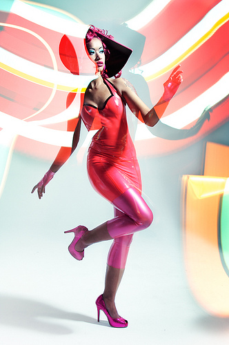
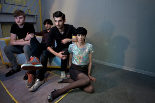
HEELS CATCH FIRE, Band shoot for Brighton Source cover


final-cover-heels-catch-fire

With Darkdaze set to create the new promo image for Heels Catch Fire, we decided to tie in the Source cover shot to accompany the interview the band had just given to The Source.


The set built for the band had been painted grey completely, carpets, walls, lights, flowers and with the bands promo image finished it was time to turn onto the Source image. The Source needed some strong colour a new direction and different feel.


With the work of Emma Sandham King and M.Halls, taking the already reduced grey set they built on top of this using yellow insulation tape and some creative yellow painting. The idea was to take the uniform grey flatness of the set and ‘draw’ on top of it creating a graphic aesthetic with hints of architecture.

 insideheelswebversion

Lighting put in place by Kev and Tash, struck hard edged shadows to fit with the graphic quality, picking out, highlighting and adding to the tonal shading of the set. They also added the soft glow from the “as close as you can get soft box” gelled up with blue that lights the band and hopefully gives them some focus.


Final shot taken by M.Halls, lighting Kev and Tash with additional set work as well as styling by Emma Sandham King and Stevi Jelbart of Ophelia Fancy, throughout the day make up and hair was kept in check by Janeen Cove at Square Roots and Gary at Square Roots (assistants Myrtle Lambert and Bryony Long)


Catch The James Kendall’s interview with the band in the latest edition of The Source in most outlets in Brighton, or read more of it here www.brightonsource.co.uk, as they prepare to play this years Loop festival.


Flash photography course - Students work

We’re very proud of our students at Garage Studios. We’d like to show you some recent-ish examples of past students work from the Flash / Strobist photography course that we run from Brighton’s biggest photography studio & training centre.

We’re taking bookings for the next one day course being run on Sunday July 19th. If your interested in this course, drop us a mail to

gangsteremma

img_8813

3604838018_96d725de20_o

3342268623_de24efc077

img_0059

3048030594_35c4e11666

3029703366_381a036096_o

juliet

(Many thanks to the past students who have contributed their work to this blog post.)

The next one day FLASH: Improve your lighting techniques course being run, will take place on Sunday July 19th. If your interested in this course, drop us a mail to

DRAWING ROOMS - workings in design, spaces and sets

With a large open studio and the accumulation of many different props on the mezzanine, it was easy to embark on a personal investigation concerned with the manipulation of real space and the space that eventually ends up on the picture plane.

Having studied architecture I (M.Halls) am accustomed to using the principles of technical drawing for both construction and for the communication of ideas about space. Using some of this knowledge and technique I was interested as to how could be applied to my photography.

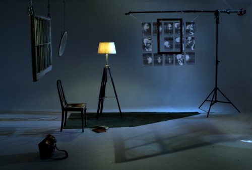
drawingroomwebversion

 As with any discipline, personal working processes are built up and developed so that one has an approach that may be applied to different subjects and projects. As far back as I am able to remember I have tended to approach any brief or idea, photographic or otherwise in the same way; that is with drawing.

 When studying or practicing architectural design, this sketching is developed further into quantifiable drawings. Each drawing convention dictates something about how we read the drawing and tells us something further. They are frameworks in which the designer can move, make changes and inform the viewer of something.

 With this photograph I wished to apply some of the same rules and laws. Equipped with an empty studio and a 50mm lens, I looked to use the space through the viewfinder as the sheet of daler rowney ice white paper pinned to the drawing board.

 Again I looked to the conventions of technical drawing as inspiration, we understand images in these drawings as being whatever they depict, lines build up planes which are read as walls and these walls in turn create believable spaces. I wanted to build up the idea of a specific place, a room, which can immediately be read or understood, but at the same time is limited in the information used to describe or define it.

 By setting the camera, up pointing it at the infinity wall a clean white frame is viewable through the viewfinder, the infinity cove disguising the immediate spatial construction of floor and wall. I selected a group of objects that I knew would start to suggest the space I had been thinking of, placing them in the frame immediately starts to define more about the space. With this in mind I continued to add and subtract from the frame, ordering and reordering them and considering the difference each change made. The frame became workable as a drawing, alterations made and then re-shot (rubbed out and redrawn). As with any picture there are specifics about the final image you are trying to create that you continue to strive for, this process of working allowed a certain focus that allowed me to continue until I was sure of the space, the reading and mood of the space.

 Lighting the shot, at first for me was all about highlighting and emphasizing barriers, divisions and the spatial rules I had hoped to build in. I then wanted to add to the believability of the space by creating lighting which brought the image back to the more normal idea of a domestic space.

  At Garage Studios we aim to take your ideas and personal projects seriously and to develop and expand them as far as you want to. Our courses are aimed at furthering your technical skills in anything from studio lighting to specific camera use, but they also have a strong emphasis on a personal position in photography, creative thinking, and the development of ideas. If you are interested in seeing what we can do please contact the studio. As well as our courses we also offer 1:1 tuition, or if you have a idea you need to shoot we have a large studio and all the equipment you need to make it happen.